The WHO Data Design Language (DDL) provides building blocks and techniques for creating rich information experiences for everyone.
Our objective is to ensure that a user's experience of our data presentation is as informative, equitable, accessible and delightful as possible.
Deliberately not designed as a rule set, but rather a toolbox, the DDL includes a chart library, design guidelines, colour and typographic style specifications with usability guidance for internationalization (i18n) and accessibility (a11y), all reflecting our data design principles — ready to use and apply in a variety of settings and environments.
Core Values
Clear
Data presentations are tailored to information needs, understandable and approachable.
Transparent
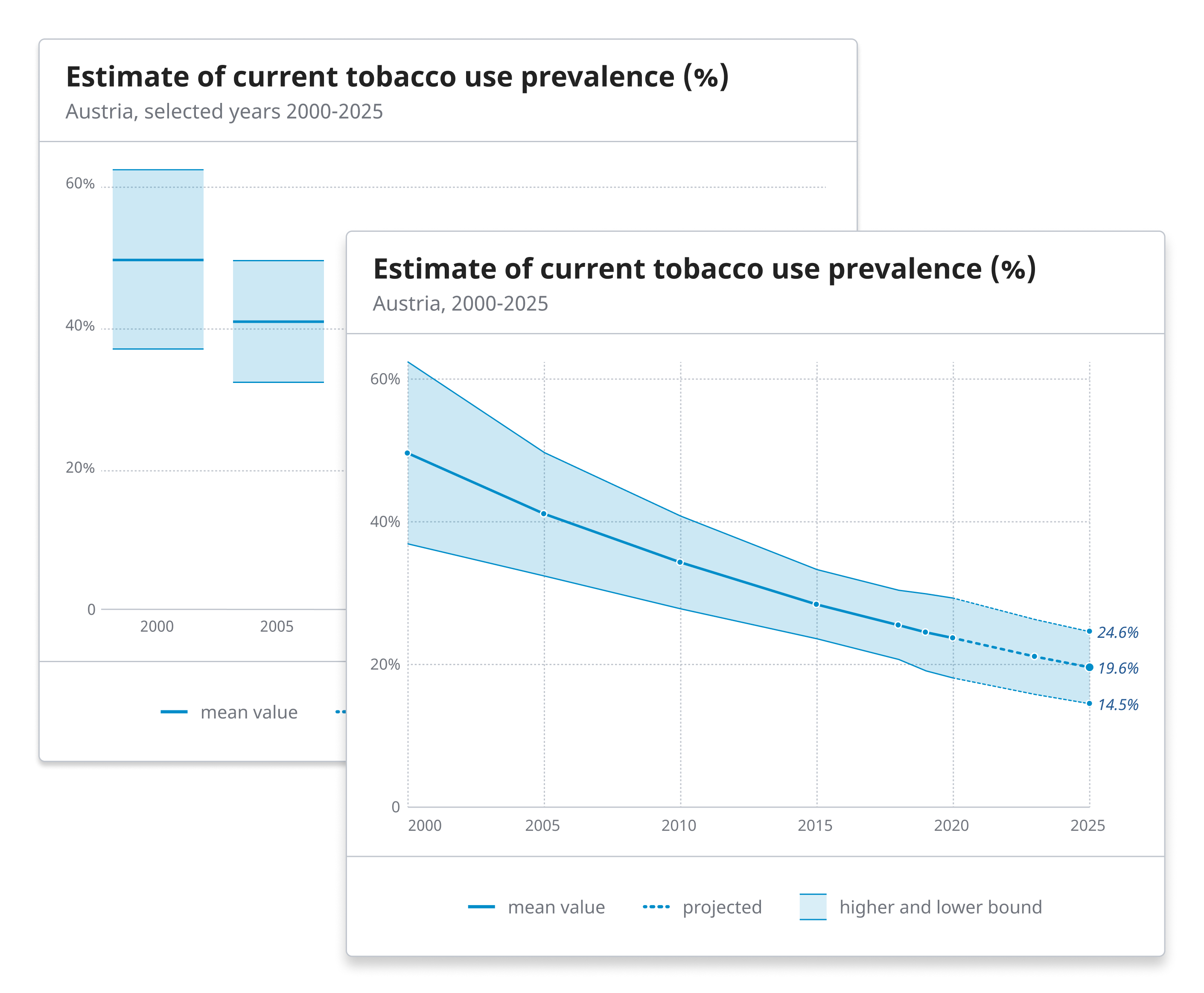
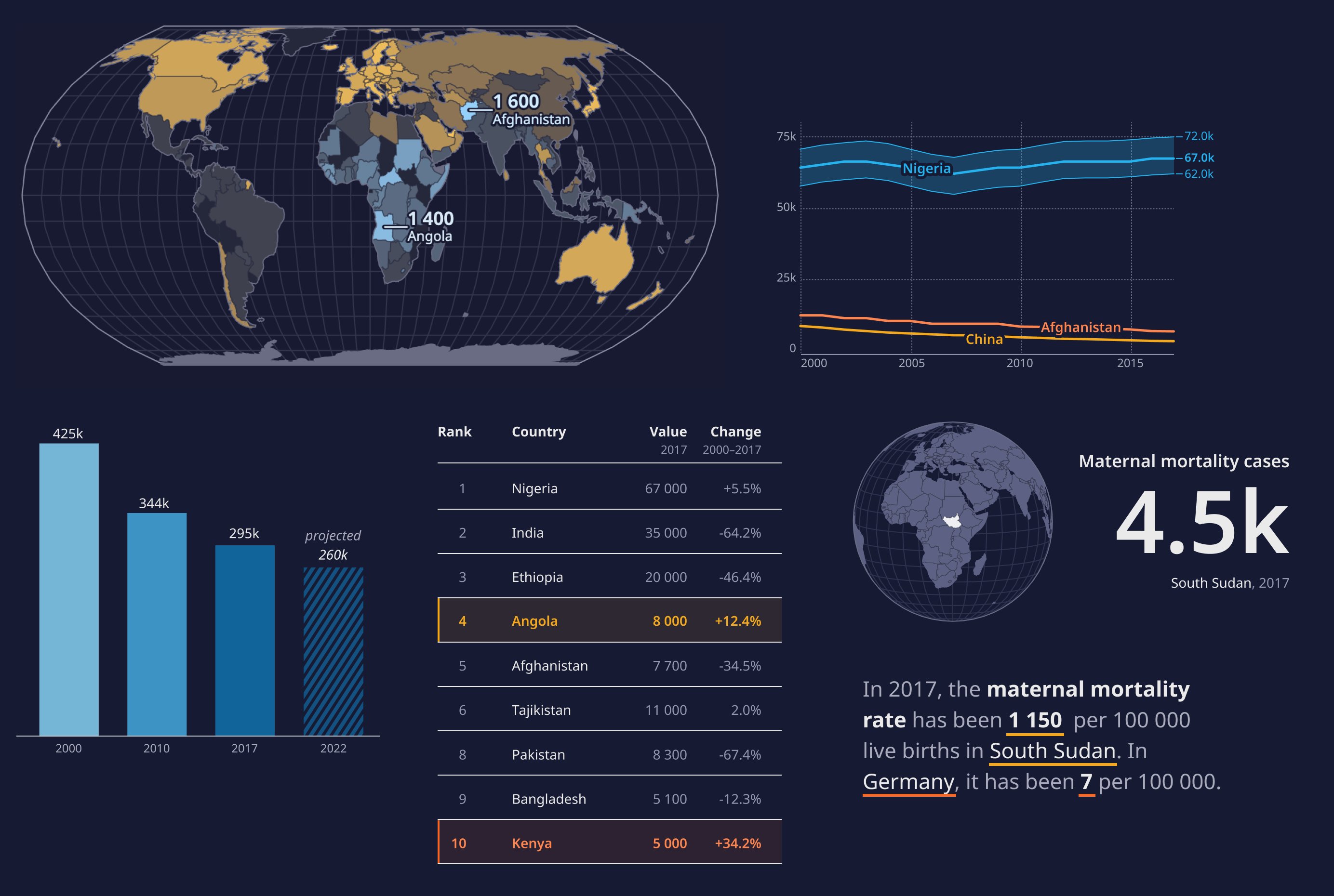
They reveal uncertainty, precision, provenance, and coverage of the data.
Open
We create rich data experiences for everyone, through accessible, international, adaptable, and participatory approaches to data visualization.
Robust
Data can be consumed in a variety of channels and sizes, through robust and lean technological solutions.