v0.9.2

Design system

The data design system provides building blocks and techniques for creating rich information experiences for everyone.
Charts

Enabling rich data experiences for everyone goes beyond just providing better looking charts — by establishing a coherent, expressive and inclusive data design language, considering the interplay of text with graphical content and taking a variety of user needs, capabilities and communication channels into account.

Deliberately not designed as a rule set, but rather a toolbox, the DDL includes a chart library, design guidelines, colour and typographic style specifications with usability guidance for internationalization (i18n) and accessibility (a11y), all reflecting our data design principles — ready to use and apply in a variety of settings and environments.

For our content creators, we provide an easy to use toolbox, tailored to WHO publishing needs. For our audiences, our approach enables consistent, clear and transparent access to public health data from a trusted source.
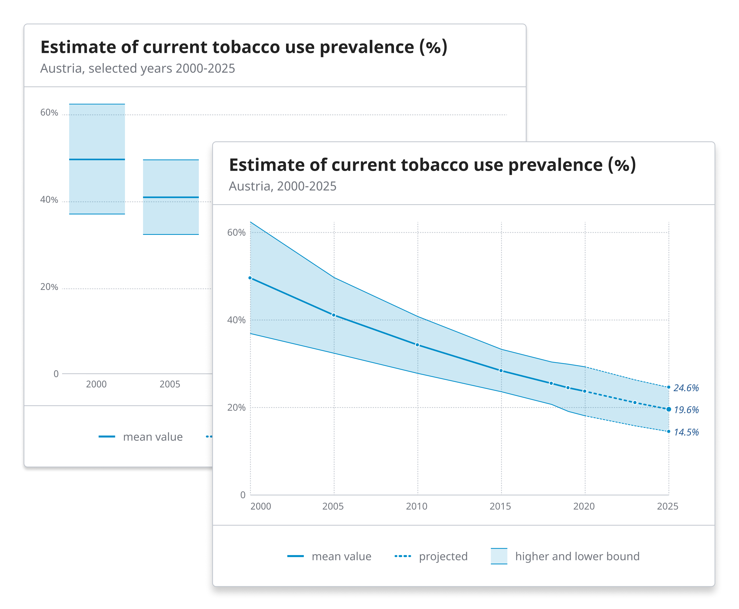
Featured

Elements


Colors
Building on the WHO color palette, we developed a set of beautiful, and expressive color themes with corresponding scales.
Learn more

Typography
Our charts use a fixed set of sizes, ranging from xxl (for large numbers) over m(for normal text) to s (for captions and axes labels).
Learn more

Symbology
We use a defined vocabulary of shapes, textures, icons to represent specific data properties.
Learn more

Chart anatomy
Our charts follow a compositional logic: functional elements and visual layers can be reused and encountered across chart types.
Learn more

Interaction
We follow a stringent "filter" and "focus" model for determining a charts data perspective and presentation.
Learn more

Responsiveness
The dimensions of a chart have an effect on its rendering. This will affect not only font sizes, but also to chart type and interaction possibilities.
Learn more